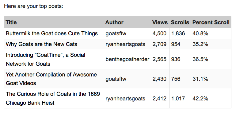
Early on, we made a counter-intuitive decision. We were not going to build a dashboard. Instead, we would send a daily, weekly and monthly report to our publishers with info on how Contextly was working and other info about their sites.
It turned out the open rates were outstanding. Publishers began asking for more. How can we send this report to more of our staff? Can you include X feature?
We’d stumbled onto something right.
Every service for publishers and indeed almost every SaaS company promises a dashboard. It’s basically a cliche of any SaaS company pitch.
The hope is their service is so integral to their customers that their customers will have their dashboard open all day, every day, checking their stats. Non-stop.
The reality is that publishers have a job to do: creating great content that serves their community. Data helps with this, but for the most part, there is a rhythm to this job that doesn’t involve having 12 dashboards open all day long.
In fact, dashboards get in the way of productivity. Reading dashboards feels like getting something done, but it’s not actually getting anything done.
So we send reports.
Contextly’s analytics reports summarize both the publisher’s and Contextly’s performance.
Contextly reports break down the top performing stories. The reports give a sense of how deeply readers got into any individual story. It includes a list of the top evergreen stories to help sites learn to create more stories that give value over time.
Here’s a fake report snippet from a blog we wished existed (all about them goats). We can’t share a real one since our client data is private.
You can learn more about our reports and how to read them.
We almost never get a request to build a dashboard instead of our reports. Mostly we get requests to add more people to the reporting, which we are happy to do even though it’s simple to add new recipients on your own via the control panel.
Think of reports vs. dashboards as push vs. pull. If done well, pushing information to people is way more powerful than making it possible for them to pull it themselves. We are all way too busy.
So we push the data that helps editorial and business teams do their jobs better. That doesn’t require fancy graphs, speedometers, browser bookmarks or logins. The data just shows up.
Reports do require thought: you want to push concise and actionable data that gets delivered to the folks that need it in an easy to understand format.
We also made it possible for sites to order daily, weekly or monthly reports with the click of a button.
We keep adding to our reporting as we add new features, but we’ve stumbled onto a real lesson.
Reports beat fancy realtime dashboards all day, any day. #teamreport
[For the month of November 2015, in honor of <a href=”http://nanowrimo.org/”>National Novel Writing Month</a> and National Blog Posting Month #NaBloPoMo, I’ll be writing a post a day about a favorite Contextly feature. It’s a bit of a love letter and a bit of a how-to.]
If you want to try Contextly on your own WordPress site, you can download it from the <a href=”https://wordpress.org/plugins/contextly-related-links/”>WordPress plugin gallery</a>, or you want to learn about our custom CMS integration, <a href=”https://contextly.com/contact-us/”>drop us a line</a>.

