Sometimes a new paint job is more than just a paint job.
We set out a while ago to move to a more modern design with our recommendation modules, and we definitely did that with 3.0 which we released on Thursday.
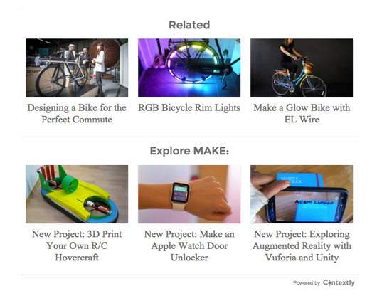
For instance, here’s a screenshot of a live 3.0 main module display.
And here’s the new default sidebar design. (Have you made or re-used a sidebar yet today?)

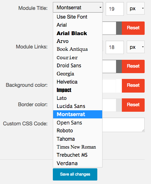
We also gave publishers more point-and-click controls over the display:

And there’s lots more font choices now, including your site’s default.
We also decided it was time to optimize some old code and lay the rails for some new features.
So in addition to the cleaner display, we re-wrote the code that makes our content recommendations modules responsive. Now we handle some edge cases better – like really wide displays and large images in the in-story sidebars.
We also added a little more space between individual recommendations and between rows.
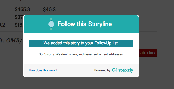
For our Enterprise sites, we updated the FollowUp button so that the second time a reader chooses to follow a story, the subscription is auto-magically added to their subscription list without need to re-enter their email address.
Perhaps most importantly, underneath the new paint, we built a foundation to make it easier for us to introduce new features and display modules. The details of the scaffolding aren’t very exciting, but the possibilities are.
With 3.0 out and sitting pretty, we’ll be rolling out these new features over the coming weeks and months to give publishers even more tools for building engagement and giving readers great experiences.